Section I: Semester-long Advertising Strategy
When Rachel Swiezynski and I came together to form the marketing team for The Student Publication, we outlined specific goals we hoped to achieve throughout the semester. Prior to this year, there had been no coordinated effort to market The Student Publication. Rachel and I are both students in the College of Design pursing degrees in Graphic Design and Architecture respectively, and as such had very narrow formal understandings of what it meant to market a product. Throughout our time in school it has become evident in both of our chosen fields that the ability to promote and sell ones creative idea plays a key role in the acceptance or rejection of a design; we knew the lessons from a semester spent developing and enacting a marketing strategy for The Student Publication would contribute to our abilities as effective designers.
During the first week of the semester, Rachel and I laid out an ambitious marketing strategy for the semester – of course, at the time we did not realize we were being ambitious! Our approach was guided by the two driving concepts of visibility and interaction. We developed a three-fold strategy that would work towards achieving these ends in various and overlapping ways. First, we would work in a variety of mediums to generate College of Design and campus-wide interest in the Publication. Second, we would aim to get students, professors and professionals involved and invested in the creation and implementation of the Publication. Third, we would continue developing the website to establish a strong online presence that complimented the in-process printed version of the Publication. Given that The Student Publication is a mystery to most students outside the College of Design (and honestly also to a large percentage of students inside the COD) we wanted all of our efforts to work on raising awareness of its existence. Some of our efforts paid off, some did not. Some worked well, some only marginally. We learned lessons about feasibility, persistence, and nuance, and how to change directions in the middle of an effort.
Generating College of Design and Campus-Wide Interest
We printed and disseminated collection boxes and response cards developed by students from the fall semester to all the libraries on State’s campus with the hope that students would come across the box, fill out a card, scan the box’s QR code and visit our website. We also mailed out the Prospectus to all past donors and local, national and international Colleges of Art, Design and Architecture, along with numerous bookstores. Rachel spent the better part of 2 months developing a kinetic video installation for the Immersion Theater in the new Hunt Library (the architect for whom contributed a piece to The Student Publication) – the video provided background on The Student Publication, details about the design and content of this year’s volume, and an advertising plug for the end-of-semester launch party. Unfortunately we hit a roadblock when the Immersion Theater went down for a month and we were unable to display the video during the semester (plans are in the works for getting the video into the summer rotation). We also created a Twitter account with varying success – a more concerted dedication to tweeting news, updates, photos and questions would have activated our Twitter account more and capitalized on its platform for networking and advertising.
Getting Students, Professors and Professionals Involved and Invested
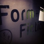
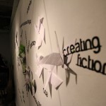
We reserved a pin-up space in Leazar, the heart of the freshman studios in the College of Design, to put up a large interactive installation piece comprised of the question squares developed in the first semester. Spelling out TSP Form + Fiction, the installation was up for 5 days. Students taking classes in Leazar would walk through the installation, read fellow student responses, and contribute their own. The card installation resurfaced at the launch party, where we wallpapered an entire room with the cards for an immersive and slightly overwhelming visual experience. The details and success of the launch party, replete with images, will be detailed in a subsequent post.
Develop the Website to Complement The Publication
Throughout the semester we collected response squares from the library boxes and, coupled with those from the installation, began posting the responses onto the website. Students who filled out a square could navigate to the website, scroll through and find their response publicized and archived alongside their peers. In an effort to elicit content for the website, we wrote a prompt and nominated classmates across a variety of disciplines whom we thought would contribute something interested on the topic of Form + Fiction. By personally nominating them to contribute we hoped they would take the invitation seriously and put something together. While we did receive initial interest and commitments, ultimately no one followed through to post content to the website. This may have been a fault of sending the nominations 6 weeks before final reviews coupled with the procrastination typical of college students, but this advertising effort did not yield any results.
Section II: Case Study Participatory ex. Launch Party
Participatory Projects
The two largest projects we as the marketing team took on were a promotional video for the Immersion Theater at the Hunt Library and the end of semester Launch Party coinciding with the release of The Student Publication. Sustained issues with the technology behind the Immersion Theater caused a delay in the installation of the video past the end of the semester. With a little tweaking of content, we plan to launch the video at the start of the summer to advertise the class for the next semester and inform library visitors about the premise of The Student Publication. After the issues with the video, we shifted our focus toward establishing the concept for and design of the launch party.
Brainstorm and Visualization
When we began to brainstorm ideas for the launch we agreed that we wanted it to simultaneously showcase the publication and also be a celebration of its completion. We hoped to create a space that people wanted to socialize in and further discuss the ideas driving the publication. In order to achieve this we decided to establish various participatory moments and opportunities that unfolded throughout the space. After deciding on FishMarket as our location, we set about storyboarding the user experience. Neither Holland or I had been to an event at the Fish Market previously, which gave us a blank slate and creative freedom to visualize and develop the space in our own way.
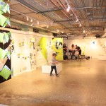
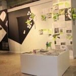
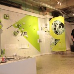
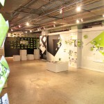
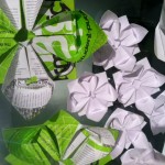
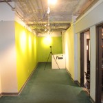
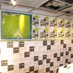
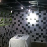
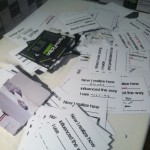
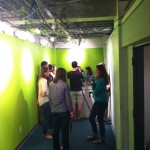
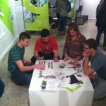
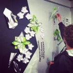
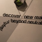
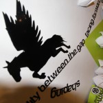
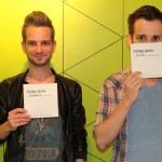
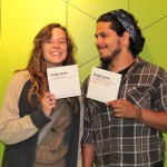
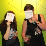
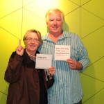
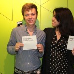
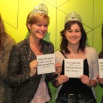
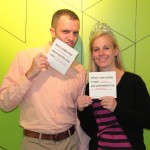
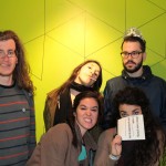
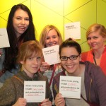
Visually we wanted to draw inspiration from the design of the publication for the space. We kept the bold color scheme and drew off of the idea of active collage, which we saw as a perfect opportunity to incorporate participation. The idea was to enable participants to create collages using press sheet pages from the actual publication, words drawn from the text and printed on sticky vinyl, prospectuses, and origami. We also wanted to use the conversation cards previously created. Similar to the instillation we had already created in Leazar, we planned on papering the walls of one of the smaller spaces from floor to ceiling with blank cards. Lastly we decided to create a photobooth using the back hallway, where people would fill out the conversation cards and take a photo with their card and friends. These images would then be projected on the entrance wall, creating a dynamic entrance drawing people in and creating interest and curiosity in participating themselves.
Construction and Development
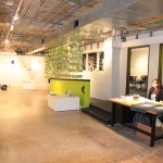
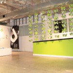
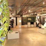
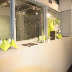
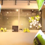
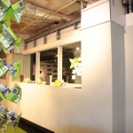
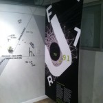
With the help of everyone in the class, the construction of the space came together really well. Using the geometric shapes, Jillian (a gifted painter and fellow student) painted a background for the collages on the walls. We transformed the section openers into banners to divide the main space into Past, Present and Future sections, correlated to the sections in the publication. This really helped to break up the larger space of the gallery. The photobooth was created by painting the back area the with the shock color green, enclosing the space. We added textural origami to the walls, and folded prospectuses into hanging room dividers meant to direct foot traffic in the way we intended circulation to occur. After the construction and installation the place was truly transformed. The language of the publication was well translated into the design.
Experience and Successes
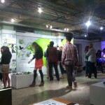
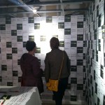
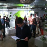
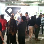
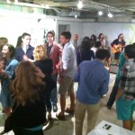
Given the number of students, professors, and Raleigh residents who experienced and participated in the space, the launch party was a complete success! Given that we timed the launch to take place on a First Friday, we were able to draw a sizable crowd from the streets. The participation by the viewers was what really made the party successful. People flowed easily through the gallery, taking time to participate in each section. Upon entering, people were greeted by projected images from the photobooth. Most entered the first room off the entry where student work from the semester was on display, and then made their way to the adjacent room, covered with squares for response. The reaction to this room was quite a surprise to us, as the space was packed with people throughout the entire night. Many people took the time to look at the cards already filled out, reading and commenting on them, as well as filling out their own. People made their way through the main gallery space, adding to the collage, stopping to talk in large groups, before making their way back to the photobooth. Many people came up to all the students and complimented them on the space, inquiring about the publication and about the class.
The experience of brainstorming, visualizing, and constructing an experiential display space was new to both Holland and I. Seeing the success of our efforts and hearing people express sincere interested in the publication was very gratifying and was exactly what we hoped to achieve with the party.
