Latest Posts

Lies, Damned Lies, and Statistics: Exploring the Relationship Between Aesthetics and Interpretation

By Mac Hill

The Oxford Dictionaries declared “post-truth” as its 2016 word of the year. The year saw the rise of “alternative facts” and politicians declaring traditional and respected news sources “fake news” when they did not agree with a story. The truthfulness of data and data visualization has also been called into question. According to the Guardian US’s data editor, Mona Chalabi, 4 out of 10 Americans distrust the government’s economic statistics (2017). While this statistic is frightening, it makes sense. Data can be skewed and selectively used as evidence to strengthen un-truths and falsehoods. The same is true of visualizations. The visual decisions designers make can be highly subjective and change the viewer’s interpretations. Designers have to understand how aesthetic choices can skew a viewer’s perception in order to produce clear and objective visualizations.

So how can designers explore this relationship between aesthetics and interpretation? Try lying. By exploring how a visualization can lie to a viewer, designers gain a greater knowledge of their own power over a viewer. The project, aptly named “Lies, Damn Lies, and Statistics” after the Benjamin Disraeli/Mark Twain quote (“There are three kinds of lies: lies, damned lies, and statistics.”), prompted students to combine two unrelated data sets in a series of data visualizations that suggest a correlation, or even causation. These visual explorations employed both traditional statistical methods, such as line graphs, histograms, bar charts, and scatterplots, and more experimental methods like 3D modeling and animation to present the data in a skewed way. The final visualizations demonstrate challenges to visual literacy and techniques that change a viewer’s interpretation, specifically through color, material, shape, and metaphor.

Color and Material

Linking color to data is somewhat difficult. Traditionally, sequential color schemes that move from light to dark are used for quantitative data, with low values in lighter tints and high values in darker tints (Kelleher and Wagener, 2011). Adding more colors to the scheme or varying the direction of the scale can throw a reader off, pushing the acceptance of the established conclusion provided by titles.

by Bree McMahon

by Bree McMahon

The same can be said of material in 3D visualizations. Using reflective materials distorts the sizes of objects and changes the viewer’s interpretations.

by Mac Hill

by Mac Hill


Shape

Viewers often have trouble accurately estimating differences in 2D areas, and when those areas are presented in radials or circles, it makes it even more difficult for the viewer to understand what’s being compared. While radials and pie charts might be visually pleasing, they are difficult for a viewer to interpret and lend themselves to false conclusions (Quach, 2016).

by Clément Bordas

by Clément Bordas

by Mac Hill

by Mac Hill


Scale

Traditional data visualization methods argue that scales should be aligned and similar to aid in interpretation. For this project, designers skewed and cut off scales as a means of lying to the reader (Kelleher and Wagener, 2011).

by Amber Ingram

by Amber Ingram

by Grace Anne Foca

by Grace Anne Foca


Chart Type

Not every visualization fits every data set. As readers, we’re trained to interpret different visualizations in different ways, so when a designer chooses a chart that would traditionally be inconsistent with a data set, it challenges the reader and skews the final interpretation. Clever designers can use this to their advantage, letting the chart type lie to the viewer (Quach, 2016).

by Dajana Nedic

by Dajana Nedic

Information Overload

Data visualizations can be a challenge for a viewer’s short-term memory, the home of sense-making. Despite our short-term memory’s capacity for high-speed information processing, it’s limited in its capacity. (Few) Visualizations that present numerous data sets in one visualization can challenge a reader’s recall, making them a challenge to read and encouraging the viewer to give up and accept the proposed conclusion rather than explore the data.

by Rachael Paine

by Rachael Paine


For more details on this project please visit 
design.ncsu.edu/sothen/lies

Mac Hill is a recent graduate from North Carolina State University’s Master of Graphic Design program. She’s interested in how design can make information more accessible to wider audiences.

References

“3 ways to spot a bad statistic.” Chalabi, M. (Director). ().[Video/DVD] Retrieved from https://www.ted.com/talks/mona_chalabi_3_ways_to_spot_a_bad_statistic

Few, S. “Data presentation: Tapping the power of visual perception.” Retrieved from http://www.informationweek.com/software/business-intelligence/data-presentation-tapping-the-power-of-v/31400009

Harris, R. L. (1999). Information graphics: A comprehensive illustrated reference. Oxford University Press.

Kelleher, C., & Wagener, T. (2011). “Ten guidelines for effective data visualization in scientific publications.” Environmental Modelling & Software, 26(6), 822-827. doi:10.1016/j.envsoft.2010.12.006

“Most of trump’s charts skew the data. and not always in his favor.” Washington Post. Retrieved from https://www.washingtonpost.com/graphics/politics/2016-election/trump-charts/

Quach, A. (2016, -03-12T00:20:48.476Z). “Why pie charts often suck.” Retrieved from https://medium.com/the-mission/to-pie-charts-3b1f57bcb34a

Tavernise, S. “As fake news spreads lies, more readers shrug at the truth.” New York Times. Retrieved from https://www-nytimes-com.prox.lib.ncsu.edu/2016/12/06/us/fake-news-partisan-republican-democrat.html

“Word of the year 2016 is… | oxford dictionaries.” Oxford Dictionaries. Retrieved from https://en.oxforddictionaries.com/word-of-the-year/word-of-the-year-2016

From Stem Cells to Big Ideas: An Exploration of In Vitro Meat through the Lens of Schema Studies

By Clément Bordas

Consumption of meat in the United States is on the rise, with projections suggesting that it will reach a record high in 2018 of 200 pounds of beef, pork, and/or chicken a year per capita. While American consumption of meat increases, people in developing nations are also consuming meat several times a week.

With sustainability issues challenging industrialized animal agriculture, in vitro meat could be a potential solution, producing meat in a more humane way while still meeting demand. Researchers disagree over whether or not in vitro meat production is a better and more sustainable production system; however, it provides an interesting topic to explore the acceptance of an idea.

Schema studies provide an interesting framework to explore the acceptance of in vitro meat. Schema analogies make the strange familiar by introducing something that we can relate to and comparing it to something we aren’t familiar with. The opposite is also true; they can make the familiar strange by using new insights and creating unrelated or unexpected connections. Schema extends the range of interaction we can have with things and allows us to engage in more dense communication and interaction.

For instance, I positioned in vitro meat production within the narrative realm to introduce schemas that provide information on aspects of in vitro meat production. My narrative takes place in a future era where people’s receptivity, as defined by David Rose’s Audience Receptivity Gradient, ranges from accepting ideas to becoming an advocate for the cause. What if in vitro meat production has matured to the point that it is common place?

I explored schemas that used science, education, tourism, cosmetics, agriculture, food conception and distribution, and design as sources of familiar artifacts to introduce the user to in vitro meat production concepts.

Figura A: Stem Farms

Stem Farms

Figure B: Love the Calf

Love the Calf

Figura C: In Vitro Ads

In Vitro Ads

Clément Bordas (MGD ’18) is a French graphic and digital designer. Thanks to his studies, he has had the opportunity to apply his graphic design skills to many sectors like science, tourism, art and technology. He is interested in the impact of technology on the design profession and the experimentation resulting from it. He has lived in several cities in France but also abroad, in Paisley, Scotland, London, England, Norman, Oklahoma and now in Raleigh, giving him the cultural diversity needed in the creative thinking process.

Can Delight Prompt In-Person Conversation?

By April Maclaga

We all likely have had the experience of being passionately engrossed in conversation with someone when that someone suddenly breaks eye contact… to look at their phone. (um…sure, it’s ok to ignore me…)

We find it very difficult to resist the call of our networks, which lure us with promises of mysteries and excitement that are designed to be hard to resist.

We find it very difficult to resist the call of our networks, which lure us with promises of mysteries and excitement that are designed to be hard to resist. Networked technologies put us in touch with entertainment, information, and individuals that are not in our shared space. Enticing forms, sounds, and imagery compel us to maintain a persistent state of connection. While these connected technologies can bring people together, they also have the potential to disrupt our in-the-moment experiences. Connected technologies can distract us from those physically around us and inhibit in-person interactions—the very interactions that uniquely lead to opportunities for self-reflection, understanding, and empathy. Empathy helps individuals establish and maintain personal relationships (Turkle, 2015). Studies in a range of research disciplines—including sociology, psychology, and strategic communications—have found that merely the presence of networked technologies can reduce the potential for empathy during conversation (Misra, 2016; Przybylski and Weinstein, 2013; Drago, 2015).

As designers of the technology we use, we can design interactions to be more human-centric and to honor the experiences we find valuable. My study focuses on encouraging interactions that facilitate face-to-face encounters, with the aim of increasing the potential for empathy. While some research has shown that the presence of technology can reduce the potential for empathy during in-person conversation, my research looks at ways that technological interventions and affordances might prompt and facilitate empathy between people working toward similar goals. My hypothesis proposes that technological interactions in a physical space can be designed to support in-person conversation and connection, offering opportunity for building empathy.

Older adults (seniors ages 65 and older) are an audience who can benefit from empathy-building relationships through face-to-face interaction. Factors such as retirement, changes in physical abilities, and personal loss can lead to isolation and loneliness among seniors (Chen, 2015). Friendships can help counteract these conditions by providing emotional support to help relieve stress and provide cognitive, social, and physical benefits (Suttie, 2014). To investigate ways in which technology can encourage face-to-face interactions, I have situated my investigation within scenarios that address older adults who are co-located in a fitness environment. This environment provides an atmosphere for achieving common goals (maintaining health, socializing) and a location where the same people may potentially see one another repeatedly, but may not engage in meaningful interactions.

One element I am considering in my study is the value of delight to facilitate connections and increase the enjoyment and fun in the designed experience. Where can delight be created in an experience? To investigate this, I created a journey map representing a typical scenario in the physical space and identified interaction points along the path to explore (Figure A). For example, what if something delightful occurs at the water fountain that could cause people to talk to each other?

Figure A: Journey map through the existing space, identifying potential points of interaction and scale of technology effective in the space.

According to Rowe, designs need to be pleasurable in addition to being functional and reliable. He identifies surface and deep levels of delight (2014). Surface level delight uses techniques such as attractive interfaces, animation, and sound to create pleasurable experiences. However, surface level delight runs the risk of becoming a novelty factor that can fade over time. Deeper delight seeks to make an interface disappear to the user so that the user can get into their flow and be productive. Other theorists chime in on delight to deconstruct it differently, but all come to the conclusion that deep delight helps a user become better and points to the importance of knowing the users (Rowe, 2014).

In my studies, I am exploring delight through motion detection, responsive technology, and discovery. I am considering moments of serendipitous encounters and uncontrolled interactions to elicit delightful moments. What happens when two people cross simultaneously and discover they have something or someone in common (Figure B)? Might this information be enough to spark a conversation between people? Possibly. But how would a system know this information?

Figure B: Two people discover they know the same person in passing.

What if there is an autonomous being that roams the space, gathers biometric and spatial information about the people and their activities, then publicizes it (Figure C)? The notion of something unexpected appearing suddenly can certainly be delightful and break through barriers to communication, but does it encourage talking with others? Maybe. My research showed that personifying this particular being led to more interaction with an interface than with other people, although the intention was good. The omniscient, uninhibited nature of a free-spirited being certainly would have a lot to share (gossip-style), but could it be interesting enough to get people talking?

Figure C: You’ve been spotted! A social visitor has come to visit (and gossip).


My goal is to get people to talk, and if I want to reach people on a deeper level of delight, then perhaps the interface is not the focus, but instead fades into the background. In my investigations, something that emerged was the need for delightful moments to be permanently possible, but only to occur at serendipitous moments that somehow were determined by… us. This led me to shift the focus from profile or biometric data to gestures. Not only does this free up the potential for delight to occur anywhere, delight becomes the direct result of actions we take (Figure D).

Figure D: The system detects a level of connection and boldly prompts the viewers.

We are all capable of initiating conversations with another and, in so doing, may discover a delightful element that ultimately leads to a meaningful connection. Sometimes we just need a little prompting.

April Maclaga (MGD ‘17) has a background in computer science and a passion for organizing things. Her interests at the College of Design center around designing for experiences and interactions. She has presented projects to SAS, Citrix, SECCA, IEI, and at Duke and NCSU workshops. During her time at the College of Design, April worked as a TA to support undergraduate courses and was nominated for the Graduate School Award of Teaching Excellence for Mentorship in 2017. April was a winner in the 12th Annual Graduate Student Research Symposium in the category of Design, earning 3rd Place with her thesis research poster. When not working on design projects, she enjoys playing games and spending time with her husband, two boys, and their cats.

References

Chen, Nina. “Friendship is Important to Older Adults.”, September 22, 2015, http://missourifamilies.org/features/agingarticles/agingfeature11.htm.

Drago, Emily. “The Effect of Technology on Face-to-Face Communication.” The Elon Journal of Undergraduate Research in Communications, vol. 6, no. 1, 2015, pp. 13-19.

Misra, Shalini, et al. “The iPhone Effect: The Quality of in-Person Social Interactions in the Presence of Mobile Devices.” Environment & Behavior, vol. 48, no. 2, 2016, pp. 275-298, ProQuest Technology Research Professional, http://search.proquest.com/docview/1761116248, doi:10.1177/0013916514539755.

Przybylski, Andrew K., and Netta Weinstein. “Can You Connect with Me Now? how the Presence of Mobile Communication Technology Influences Face-to-Face Conversation Quality.” Journal of Social and Personal Relationships, vol. 30, no. 3, 2013, pp. 237-246, http://journals.sagepub.com/doi/full/10.1177/0265407512453827, doi:10.1177/0265407512453827.

Rowe, Ben. “Is there a Formula for Delight?”, September 23, 2014, http://uxmastery.com/formula-delight/.

Stein, Sylvia. “Seniors & Communication: A Plethora of Opportunity Areas.”, Dec 12, 2013, https://www.techenhancedlife.com/articles/seniors-communication-plethora-opportunity-areas.

Suttie, Jill. “How Social Connections Keep Seniors Healthy.”, Mar 14, 2014, http://greatergood.berkeley.edu/article/item/how_social_connections_keep_seniors_healthy.

Turkle, Sherry. Reclaiming Conversation: The Power of Talk in a Digital Age. Penguin Books, New York, 2015.

Cyborg-Centered Design: Designing the Hearing Experience for Cochlear Implant Users

By Alexandra Grossi

Since their inception, hearing devices have been designed to hide the user’s inability to hear. Glasses, on the other hand, went from being solely a vision-correcting device to being a fashion statement. Graham Pullin’s book, Design Meets Disability, challenges the way we design for disability and argues that design can help fight stigmas. Pullin questions why hearing devices can’t go down the same path as glasses. Rather than focusing on overturning stigma associated with cochlear implant (CI) product design, my design explorations use Pullin’s concepts to make the user experience of the CI Remote Assistant closer to the intuitive hearing experience of a normally hearing person. Then I take the project a step further to explore how the CI user experience might incorporate intuitive “super hearing” abilities that people with normal hearing do not have.

Cochlear implants (CIs) are electronic devices that replace the function of a damaged inner ear in people with profound hearing loss. The latest iteration of the CI, offered by Cochlear Americas, is the Nucleus 6, which has an option for a “Remote Assistant” that lets users adjust settings wirelessly. The Remote Assistant is meant to give users greater control over their sound settings. Instead, users report that its user interface is difficult to navigate and time consuming to operate.

In describing what makes clear interaction design, Gillan Crampton Smith lists the following:

  • It offers users a clear mental model
  • It gives reassuring feedback
  • It is easy to navigate
  • It is consistent (Moggridge, 2007).

Judging the usability of the Remote Assistant based on the qualities Smith outlines, it is clear that the design does not offer users a clear mental model, nor is it easy to navigate. Instead, the onus is on the user to learn and memorize the functions of the Remote Assistant. The Remote Assistant uses linear navigation that requires users to click through many screens to make adjustments to volume or sensitivity. The linear navigation is problematic because it is difficult for users to know “where they are” unless they have the order memorized. The icons and language used in the interface do not clearly inform users of their functions. Obfuscation of functions goes against Don Norman’s characteristics of good design: discoverability and understanding (Norman, 2013).

In the case of a bilateral CI user (a CI recipient who has CIs in both ears), it takes seven steps to reach the screen that allows the user to change the volume of their left ear. If the same CI user wants to adjust the sensitivity of the left ear, it takes ten steps. If a user has a microphone accessory, the user can control the volume of the microphone input, but it takes 14 steps.

Figure A

In my explorations addressing the usability of the current UI, I explore the concept of a UI that exists on many connected devices. These mini-design explorations look at the most commonly changed variables: volume and sensitivity.

Figure B

In looking at ways to expand the idea of what a hearing device is supposed to do, I went a step further to explore elements of “super hearing.” What if the user could block out the sound of a blender and make a friend’s voice louder? I explored the concept of a noise blocking feature that allows users to visualize their soundscape and select sounds they would like to either block or enhance.

Figure C

In my research, I conducted interviews with many hearing device users, and identified shared struggles for inspiration. My interviews revealed that even with this incredible technology, it is difficult for users to follow along what is being said in a crowd or in a noisy environment. Scriber is a feature that uses voice recognition software to offer users a real time and saved transcription of the world around them.

Figure D

David Rose’s Enchanted Objects examines the possibilities for objects once they are connected to the internet. A connected UI would enable a contextual interface that users can program. Over time, the UI would be able to learn the user’s behaviors and set off sequences that automate functions. I call these “routines.” Users can set up conditions such as a time of day or a location that sets into motion a predesigned routine. For example, my persona, Max, is a 24-year-old programmer who lives in a big, noisy city. Max likes to “warm up” his ears in the morning by playing a playlist that slowly rises in volume and then crossfades to environmental sounds so that by the time he reaches his office, he has completed the transition.

Figure E

Older and disabled users have been disenfranchised by the very technology that they rely on for their way of life. Including the user in the design process is key to producing a great user experience. Designers have the power to give users a stronger role in the design process. By not taking a deeply user-centered design approach, assistive technology companies are missing out on the opportunity for great innovation. They could help push progress on a cultural scale. Connecting users to the internet opens a world of possibilities. It would empower users by giving them a voice and the opportunity to think critically about the technology they depend on. My explorations in this research seek to push boundaries, and employ Human-Centered Design. While I cover a wide range of topics and ideas, there are limitless possibilities in the field. Further investigations should put the user at the center of the design process and continue to dare to ask, “what if?” and “why not?”

Alexandra Dean Grossi completed the Masters of Graphic Design Program at NCSU. She received her bachelor’s degree from Vassar College and worked in television in Los Angeles before starting a career in graphic design. She is pursuing a career in the field of inclusive design and wants to push the boundaries of what it means to design for disability.

References

Moggridge, B. (2007). In NetLibrary I. (Ed.), Designing interactions. Cambridge, Mass.: MIT Press.

Norman, D. A. (2013). The design of everyday things. New York: Basic Books, a member of the Perseus Books Group.

Pullin, G., 1964-. (2009). Design meets disability. Cambridge, Mass.: MIT Press.

Rose, D.,1967- author. (2015). Enchanted objects : Innovation, design, and the future of technology. New York, NY: Scribner.

Learning to Make: Lowering Barriers to Entry for Novices

By Anantaya “Grace” Wonaphotimuke

Starting something new can be scary. Learning new skills or entering a new social environment, even if it is a digital environment, can be overwhelming and stressful. The novice or newcomer has to overcome emotional, social, and technological (in the case of a digital environment) barriers. For my research, I am interested in how to help ease someone into learning and becoming part of a community.

For this investigation, I looked at an online community of practice where “making” is a shared interest. The members of this community participate and engage in the production of physical and digital artifacts, develop their creative skills, share their processes, and seek inspiration and advice from others. They learn and create a shared repertoire through participating in the community.

To understand the making community better, I observed different live maker events and interviewed people who joined the event. Due to the structure and goal of the events, the information disseminated was specifically tailored for beginners. However, each novice has different background knowledge and experience with making. For instance, a person who has previously done hand-sewing is going to pick up the steps or instructions for using a sewing machine faster than a person who has not done it at all.

The novices learn at different rates, and their learning experiences contribute to different emotions and levels of participation

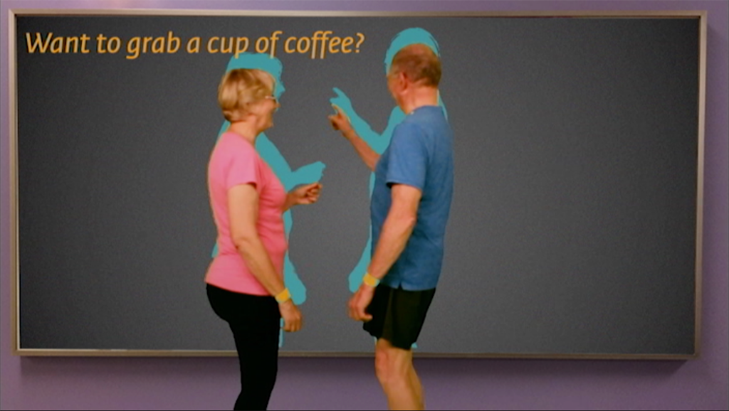
Likewise, the participant who has done programming before, even if it was a different programming language, will be able to learn the new programming language faster. Thus, the novices learn at different rates, and their learning experiences contribute to different emotions and levels of participation. I observed this from interactions between novices. Novices with some background experience sometimes shifted their role from participating to helping a novice with no background experience. However, being in the space physically has advantages over being in a digital space. The face-to-face interaction within these live maker events facilitates novice learning better than the online community due to the immediate, tailored responses for questions.

Although many online creative communities have a section dedicated for novices, novices are still lumped into the same “beginner” category. Since the online community lacks the richness of face-to-face interaction, it is challenging for novices to find information that suits their needs and goals (which depend on their background experience) or to reach out and request help from the online community.

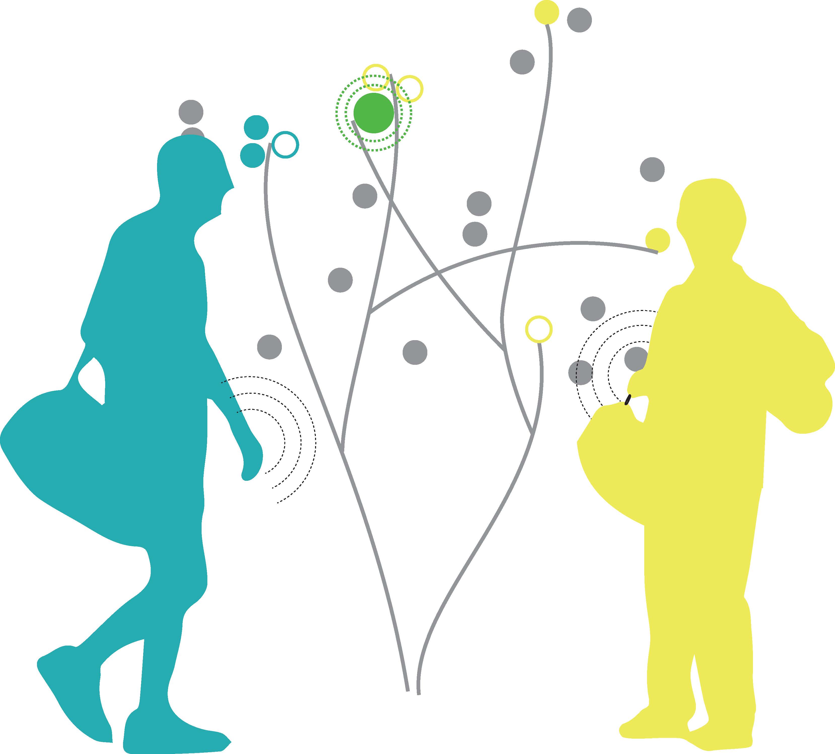
Through my research, I identified the need for a gradient of novices, the Novice Gradient, to inform the design of a contextual user interface and information architecture. The Novice Gradient asks the design of the contextual user interface to consider the user’s past experience or familiarity and the user’s behavior based on this past experience so that the contextual interface can anticipate the user’s next behavior while providing appropriate information. The goal of this contextual user interface is to lower novices’ barriers to participate and present information in a way that supports online community engagement. The contextual interface can help ease novices into their community by facilitating learning and tailoring information necessary to engage with other members. The interface can facilitate the novices’ learning goals while simultaneously supporting help-seeking interactions within the community. The contextual design looks at the current activity, while recalling past instances (Beyer, 1998), allowing the interface to consider the nuances of being a novice and to support the novice in becoming a fully participating member of the community.

The Novice Gradient asks the design of the contextual user interface to consider the user’s past experience or familiarity and the user’s behavior

I based the Novice Gradient on existing frameworks and models, including the Community of Practice framework, Activity theory, and the Five-Stage Model of Adult Skill Acquisition. The Community of Practice framework is defined as a system of interrelated forms of participation, where members come together through a shared interest (Wenger, 1998). In the Community of Practice, newcomers move from partial participation to full participation as they become more engaged in the community. By moving toward full participation, the novices engage and learn about the practice and the community (Lave and Wenger, 1991; Wenger, 1998). Since the novices are connecting and interacting with other people through a digital medium, in this case on online community, Activity theory is appropriate for investigating the way people interact with their environment through the use of digital tools and how those interactions and tools change over time (Kaptelinin, 2006; Wilson, 2006). Activity theory specifically looks at the action that results from the individual’s attributes, such as past experience, perception, motive, emotion, and ways of reasoning (Davis, 2012). Thus, past experience plays an important role in how the digital tool changes. Moving further, the Five-Stage Model of Adult Skill Acquisition defines different stages of learning a skill from being novice to expert. From beginner to expertise, each stage is identified by the differences in components that relate to the situation the learners are in; perspective that is formed from past experience; decision, analytic or intuitive, that is also based on experience with the skill; and the commitment of the person at each stage (the more they are involved and immersed in the learning situation, the more comfortable they are performing the skill) (Dreyfus, 2004). These three frameworks consider the individuals and their actions, since each individual is different. In this investigation, the main actions of the novice are participating and learning in an online community. Thus, the Novice Gradient takes the attributes of an individual and their actions into account.

The Novice Gradient defines three types of novices: newbie, novice, and advanced beginner. These novices have different past experiences that inform where they are in the gradient. Since past experience influences how the novice approaches the current situation according to Activity theory, the newbie is someone who has no prior knowledge or experience with any domain similar to the current domain. The novice knows somewhat about the current domain based on the past experience with a similar domain. The advanced beginner is someone who can transfer or apply the prior knowledge or past experience to the current situation.

These conceptual frameworks and the Novice Gradient are applicable to different online learning communities; for instance, it may or may not be applicable to K-12 learning, but this investigation is only looking at learning as a hobby. However, to ground the framework, I have developed scenarios and personas of different types of novices and explored the tools, functions, and features needed to lower barriers to entry for learning Processing in the Processing online community. The investigation also explores ways to incorporate community elements and strategies to help ease and encourage the user to participate in the community. As a result, learning to make is a complex process. Each novice level would need different tools, functions, and features that provide different information. In other words, even though the same tools, functions, and features were present, the information displayed was also different for each novice level.

If the system creates a safe space for the novice, how would the system encourage risk taking and push them further into the community?

Although I developed the conceptual framework of the Novice Gradient to inform the design of the information architecture and user interfaces and explored the possible system, it poses more questions for further investigation. If learning through participation occurs in different digital medium (not online screen-based website) or space (like a shared public space), how would the information be arranged to facilitate and encourage participation and knowledge sharing? If the system creates a safe space for the novice, how would the system encourage risk taking and push them further into the community? Moreover, people will be moving back and forth when they are learning a new skill. For instance, if the advanced beginner leaves that community for a while and he or she does not engage in that community and its information, the advanced beginner might be moving backwards in the gradient. This poses a question for how the contextual interface can facilitate or change its behavior to accommodate that individual.

The intention of this investigation is to encourage newcomers to participate in the maker community, especially the online maker community. By participating (communicating and sharing knowledge and experience) in the community and acknowledging that people are different, members of the community can collaborate, build relationships, and, hopefully, become more empathetic towards one another. Although technology mediates and helps connect people together, sometimes people forget that they are connecting with other people, not the digital tools, spaces, or environment.

The contextual user interface acknowledges the differences in people and that everyone is not the same. Designing a contextual user interface made me think about the different levels of information (data/nuances) of people and our environment. Since context is becoming more important in design, designers are asked not only to think about the users, but also the medium (where the design lives and whether the information/data should be treated the same or completely different) and the environment (past and current environment/culture). If more designers acknowledge the nuances in people, then the design could become more human-centric.

Anantaya “Grace” Wonaphotimuke (MGD ‘17) has a background in computer science and animation. Grace is interested in Human Computer Interactions, technology and learning. She is currently pursuing a Ph.D. in Design at North Carolina State University.

References

Beyer, Hugh. Contextual Design : Defining Customer-Centered Systems. Edited by Karen Holtzblatt. Morgan Kaufmann Publishers, San Francisco, Calif., 1998.

Davis, Meredith. Graphic Design Theory. Thames & Hudson, London, 2012.

Dreyfus, Stuart E. “The Five-Stage Model of Adult Skill Acquisition.” Bulletin of Science, Technology & Society, vol. 24, no. 3, 2004, pp. 177-181.

Kaptelinin, Victor. Acting with Technology : Activity Theory and Interaction Design. Edited by Bonnie A. Nardi. MIT Press, Cambridge, Mass., 2006.

Lave, Jean. Situated Learning : Legitimate Peripheral Participation. Cambridge University Press, Cambridge England] ; New York, 1991.

Wenger, Etienne, 1952-. Communities of Practice : Learning, Meaning, and Identity. Cambridge University Press, Cambridge, U.K. ; New York, N.Y., 1998.

Wilson, Tom D. “A Re-Examination of Information Seeking Behaviour in the Context of Activity Theory.” Information research, vol. 11, no. 4, 2006, http://urn.kb.se/resolve?urn=urn:nbn:se:hb:diva-2169.

Breaking the Bubble: Designing Experiences with Online News

By Robin Vuchnich

I first started thinking seriously about the design of news on the internet and its influence on public sphere and debate in 2012. On May 8th of that year, my state voted in support of North Carolina (NC) Amendment 1, crippling marriage equality. More than half of NC voters came out in favor of this shameful and discriminatory legislation, which my algorithmically filtered Facebook bubble and own confirmation bias led me to believe did not stand a chance against NC voters. My confusion and surprise about the fabric of NC was a result of being immersed for months in the like-minded, cozy, anti-amendment echo-chamber of my Facebook newsfeed. From the perspective of my snug little information cocoon, it was clear to me that nobody with a brain or heart would vote for the amendment. Well, maybe some hateful backwards hillbillies somewhere, but not to worry, we have the majority… probably. Sound familiar?

It occurred to me in the immediate aftermath that surely some of my weaker connections on Facebook were in favor of the amendment. I mean, somebody voted for it. A rather extremist thought then crossed my mind as I wondered why I’d never seen posts from people supporting the amendment. (It was the algorithms of course, but this was early 2012 and that wasn’t as apparent then.) I thought maybe these people were too ashamed of themselves to post their own backwards views, maybe they were hiding their bigotry from me. I needed to weed these people out. I needed to eject them from my online social network — and I did.

I systematically ‘un-friended’ at least a dozen people that night. I did so only because they were Republican, from my rural hometown, and because I suspected (without any real evidence) that they were for Amendment 1.

I saw countless posts from others that night with scathing comments that called for the ferreting out of the “for” voters, and of course: “If you voted for Amendment 1, go ahead and delete me from your friends.”

I had done my part to further expand the polarization gap and partisan cloistering that is upending our democracy

Not only had my narrow Facebook social cocoon obscured my view of the reality of the numbers of North Carolinians who did not share my views, it enabled me, in a fit of perceived moral superiority, to eliminate anyone (with the click of a button) who I suspected may possibly have ideological asymmetry to me. That reaction pretty much insured that I’d have zero opportunity to use the platform to debate or come to a shared understanding with people on the other side of an issue in the future. I had done my part to further expand the polarization gap and partisan cloistering that is upending our democracy.

What I learned from my 2013 thesis research (inspired by these events) was that I was living in a “filter bubble” — and so were the people whose views I opposed. This phenomenon, first described by Eli Pariser, is the idea that via personalization and algorithmic filtering, we unknowingly narrow our world views and information network (Pariser, 2011). The filter bubble concept (and Facebook mass cognitive dissonance among liberals) proliferated in online conversations and hundreds of opinion editorials in the days and weeks following the Trump election upset.

“If you voted for Trump, go ahead and delete me from your friends.” [plants face in hands, vows to leave the platform for good]

The sociological theory of weak ties asserts that any one individual has a collection of close friends who are tightly clustered as well as a collection of casual acquaintances who act as weak connections to an entirely different social cluster. Weak ties act as bridges between enclaves, thereby creating opportunities for people to encounter ideas, news, and information that they would have otherwise been deprived of (Granovetter, 1983). If we don’t have any weak ties we diminish our influence on precisely the audience whose values we hope to inform. Likewise, weak ties provide us with opportunities to interface with counter-attitudinal information and an occasional healthy challenge to our own beliefs.

Any functioning democracy relies on a fully informed citizenry who are privy to the same information through which they might make informed judgments and decisions.

Group polarization is a phenomenon that occurs when like-minded people speak only among each other. They become more ideologically unified, more confident in their views, and more extreme in their positions (Sunstein, 2009). Legal scholar and author Cass Sunstein (2009) characterizes group polarization by what he calls “echo-chambers,” where attitudinally similar people gather to discuss and seek corroboration of their ideas, sometimes at the expense of truth and sometimes in ways that lead them to extremism. The social architecture and social norms of a community either encourage or discourage the kind of curiosity that keeps the negative aspects of polarization at bay by promoting values or behaviors that promote occasional traversing into the ideological worlds of others (Sunstein, 2009).

Any functioning democracy relies on a fully informed citizenry who are privy to the same information through which they might make informed judgments and decisions. When polarization occurs, democracies may become dysfunctional and societies lose the ability to reach consensus on significant matters and policies (Sunstein, 2007).

The dramatic shift from the media models of the 20th century to those of the 21st century makes gaining shared understanding even more difficult. In the past, news organizations had commercial incentive to broadcast content that would appeal to masses. The ‘narrowcasting’ that occurs online is quite different. Targeted advertising dollars sustain online news outlets. That means they can only survive by attracting highly partisan and distinct segments of audience. This situation leads to further information fragmentation; in other words, people don’t know the same things (Tewksbury and Rittenburg, 2012). Knowledge and important discourse becomes scattered rather than shared among the members of a collective public sphere. This is a real problem for a democratic public that must collectively identify which issues are most important to deliberate on (Tewksbury and Rittenburg, 2012).

Unbiased Briefs that Live Alongside Each Version of a News Story

One strategy is to leverage machine learning to cluster and scan all published stories about a single event and identify content that is common to all. This aggregate content can be used to create an unbiased summary that is attached to all the versions of the story (for someone using the app). Simultaneously, topics found in the story that are sources of controversy or dispute are pulled forward and presented separately as quickly scannable issues under debate. Each publications’ full version of a story is available in a carousel so that users can read the publications they prefer while still seeing partisan differences in story framing and headline, creating shared awareness of events and the associated issues of dispute.

Figure A: Robin Vuchnich

Using Both Machine Learning and Human Editors

In my prototype, the critical and aggregate editorial choices of vetted news agencies across the web determine the salience of events and the top stories of the day. Machine learning is applied to detect and depreciate “fake news” and clickbait coming from content farms. This leans on traditional media agenda setting and not on social sharing trends. However, the degree of social commenting from users about the topics extracted from the story cluster also influences which of those issues rise to the surface and appear alongside the story cluster in the “issue detection bar.” This not only means that users are collectively having some new agency over the agenda setting that is done within the story, but they are influencing the content that is presented alongside an actual story.

Figure b: Robin Vuchnich

Use Shared but Disputed Issues to Stitch Together a Disparate Public

Artificial intelligence mining and networking of comments and controversial opinions from across a story cluster can help users gain context about what public debate is attached to a news event. Users can see a full spectrum of opinion and both shared and opposing ideas. By visualizing sentiment and network affinity among commenters, users can identify patterns and relationships between what people feel about controversial issues present in the news, what versions of the story they’ve read, what the sentiment is, and what social or geographical affinity the commenters may have to one another. The convergence of this information could catalyze viewing of a spectrum of opinions that fall outside of the user’s normal range of exposure. It could also create more informed critical thinking around reported events and the discourse that follows.

Figure C: Robin Vuchnich

I wish I could say that after looking at this for several months I was able to put forward a tidy and simple design solution that solved the problems the investigation uncovered: algorithmic filtering and poorly designed personalization tools that show me what I want, not what I need, to know; political polarization and echo-chambers; the degree to which advertising and fake news have corrupted our information channels; and the fragmentation of our public sphere.

What is clear is that as intermediaries of online news and information, we should facilitate environments and experiences that: 1.) result in occasional exposure to counter-attitudinal information, 2.) make visible the opinions of weakly tied social connections that may not be like-minded or politically congruent to us, 3.) encourage expansion of topical interests and awareness of controversial civic issues, and 4.) make visible and available the crucial information that lies outside of our personal information bubbles to maintain for society some level of shared knowledge of news and information. Mitigation of polarization and extremism is critical to our democracy and our ability to collectively solve problems. 

Robin Vuchnich (MGD ‘14)  is Principal at Vuchnich Design, LLC. Established in 2008, Vuchnich Design applies user-centered design and research to facilitate the goals of people in context with technology, products, and services. Robin’s work spans UX and UI design, branding and identity, visual design, teaching, multi-media design, problem framing, user testing, and design thinking facilitation.

References:

Granovetter, M. (1983). The Strength of Weak Ties: A Network Theory Revisited. Sociological Theory, 1, 201-233.

Pariser, E. (2011). The filter bubble. New York, NY: Penguin Press.

Sunstein, C. R. (2007). Republic.com 2.0. Princeton, NJ: Princeton University Press.

Sunstein, C. R. (2009). Going to extremes: how like minds unite and divide. New York, NY: Oxford University Press.

Tewksbury, D. (2012). News on the internet: Information and citizenship in the 21st century. New York, NY: Oxford University Press.

Re-Envisioning Social Media Platforms to Enhance Interpersonal Relationships

By Amber Ingram

Face-to-face communication among members of American society has been drastically impacted by the use of the internet and social media, with both falling under the larger term known as digital communication. Society is immersed in a digital world, diminishing the values of interpersonal relationships. The use of devices and technology allow people to continue to connect digitally while decreasing our face-to-face interactions. This decline in face-to-face interaction has increased from one technological advancement to another. Today, researchers estimate that “more than half of American households are connected to the internet” (Nie, 2002), and “95% now own a cellphone of some kind” (Pew Research Center, 2017). The dramatic use of digital communication has led many to question the quality of our interpersonal relationships. However, the use of digital communication, such as social media, may be the way to improve face-to-face interaction. Social media platforms should be re-envisioned to encourage face-to-face communication, leading to enhanced interpersonal relationships by modifying human behavior.

Interpersonal relationships that develop through face-to-face communication produce more positive outcomes than ones that develop over the internet

While it is impossible to deny how important these platforms have become, Americans should find a balance between online interactions and face-to-face communication. Researchers disagree over the impact social media is having on our society. Some, like Sherry Turkle, believe that digital communication gives society an “out,” allowing us to have relationships without the demand of intimacy. Digital communication allows people to connect without being burdened by the expectations of the person on the other end of the conversation (Turkle, 2011). However, other researchers, like Nancy Baym, believe that digital technology does the complete opposite and strengthens relationships. Through her research, Baym has found that the more people interact through devices, the more they communicate face-to-face (Adler, 2013). Most researchers, however, have found that interpersonal relationships that develop through face-to-face communication produce more positive outcomes than ones that develop over the internet (Sprecher and Hampton, 2016). Physical face-to-face communication allows people to have thoughtful conversations while empathizing with the other person, which ultimately creates values in the relationship. This interaction is key when developing interpersonal relationships.

Dr. Dan Siegel, Clinical Professor of Psychiatry at the UCLA School of Medicine, is concerned that society’s use of social media, email, and texting do not give people enough face-to-face interaction and that the new generation will be accustomed to a very surface level experience of the world (Siegel, 2014). He says, “It is a two-way street. The brain created social media and social media shapes the brain” (Siegel, 2014). His research on the brain shows that the right hemisphere of the brain works the body itself and therefore creates our emotions. This side is also linked to nonverbal signals that happen during a face-to-face conversation. Social media, email, and texting are forms of verbal cues, or “text with language.” This form of verbal cues causes the left hemisphere of the brain to be triggered. The left hemisphere deals more with logistics, which leads to people being concerned about whether or not someone cares if a person likes their social media post (Siegel, 2014). Other researchers agree that nonverbal cues are key when it comes to the difference between digital communication and face-to-face communication. When in a face-to-face conversation, you can share eye contact, hear tone of voice, see a person’s posture and gestures, and recognize the timing of what they do and say. These factors play an important role in effective communication and help to synchronize your brain with others.

When in a face-to-face conversation, you can share eye contact, hear tone of voice, see a person’s posture and gestures, and recognize the timing of what they do and say

Since digital communication and face-to-face communication share some common elements, social media can be used to improve the quality of interpersonal relationships. The degree to which people can communicate over a digital platform rests on the level of connectivity allowed through that platform (Sprecher and Hampton, 2016). There are platforms now that allow people to connect digitally in a way that feels like a face-to-face setting through the screen of a computer or other device, such as Skype. Research suggests that “Skype, given its ability for synchronous communication, can mitigate the effects of partner idealization that can occur over CMC (computer-mediated communication); this type of communication can give interaction partners more realistic impressions of each other’s traits and overall character” (Sprecher and Hampton, 2016). The Sprecher and Hampton study shows that participants involved in either digitally face-to-face communication or personal face-to-face communication did have a better feeling of connectedness than those using other forms of communication (such as email and texting) (2016). However, the problem with the digital face-to-face setting is that the development of an interpersonal relationship lacks in quality compared to those that spend more time communicating face-to-face in a physical setting.

Many applications promote meeting new people in person. For example, the app Meetup was created with the intention of “bring[ing] people together in thousands of cities to do more of what they want to do in life” (Meetup). Currently Meetup has 30.3 million members and 272,203 Meetup groups in 182 countries. While Meetup is a great way to get connected to others by using social media, it does not advocate for in-person face-to-face communication once you have connected with a group. The same goes for the app SupperClub, which was designed to bring people together over food. While these social media apps and others serve to improve people’s social lives, they do not guarantee meaningful face-to-face communication will take place and do not facilitate meaningful conversation.

According to Nie and colleagues, the internet is not at fault for how relationships have been transformed in society today. The internet is part of years of technological advances that have had the “unintended consequence of emotionally reducing the number and meaningfulness of emotionally gratifying face-to-face human interaction” (2002). What is diminishing face-to-face communication in interpersonal relationships is the way the internet is being utilized and for what length of time. Moving forward, there is potential for future research to develop a solution that advocates for face-to-face communication with apps. Internet use that displaces face-to-face communication only continues to grow. Societies need to have an open mind and use these new technologies in social media to their advantage. Ironically, the solution to this problem may be to utilize the very platforms that threaten face-to-face communication. However, as social media is a highly questionable set back to our society, it is important to realize the potential it could have when sustaining face-to-face communication. Therefore, the interfaces of these platforms should be redesigned to benefit our interpersonal relationships by implementing the importance of face-to-face communication that will then evolve into our in-person communication.

Amber Ingram (MGD, 2018) completed the Masters of Graphic Design Program at NCSU. She enjoys fitness, cats, bendy straws and a well-designed sans serif font.

References

A Dictionary of Sociology. (1998). Face-to-face interaction. Retrieved from http://www.encyclopedia.com/social-sciences/dictionaries-thesauruses-pictures-and-press-releases/face-face-interaction

Adler, I. (2013). How our digital devices are affecting our personal relationships. Retrieved from http://legacy.wbur.org/2013/01/17/digital-lives-i

Baym, N. K., Zhang, Y. B.,   Lin, M. (2004). Social interactions across media. New Media & Society, 6(3), 299-318.

Brignall, T.W., & van Valey, T. (2005). The impact of internet communications on social interaction. Sociological Spectrum, , 335-348.

Drago, E. (2016). The effect of technology on face-to-face communication. Elon Journal of Undergraduate Research in Communications, , 13-19.

Hansen, D. L. (2011). Exploring social media relationships. On the Horizon, 19(1), 43-51.

Kulcsar, E. (2014). Hidden relationship between social media and interpersonal communication. Management & Marketing, , 167-172.

Meetup. About Meetup. Retrieved from https://www.meetup.com/about/

Nie, N. H., Hillgus, D. S., & Erbring, L. (2002). Internet use, interpersonal relations, and sociability.

Pea, R., Nass, C., Meheula, L., Rance, M., Kumar, A., Bamford, H.,  Zhou, M. The internet in everyday life (pp. 215-243). Malden, MA: (2012).

Media use, face-to-face communication, media multitasking, and social well-being among 8- to 12-year-old girls. Developmental Psychology, 48(2), 327-336.

Peter H. Kahn, J. (2011). Adaptation and the future of human life. Technological nature (pp. 185) Massachusetts Institute of Technology. Pew Research Center. (January 12, 2017). Mobile fact sheet. Retrieved from http://www.pewinternet.org/fact-sheet/mobile/

Siegel, Dr. D. (Dec. 24, 2014). REVEALED: How social media is changing our brains and reshaping our relationships. BusinessInsider. Retrieved from http://www.businessinsider.com/social-media-impact-brain-relationships-siegel-2014-12

Sprecher, S., & Hampton, A. J. (2016). Liking and other reactions after a get acquainted interaction: A comparison of continuous face to face interaction versus interaction that progresses from text messages to face-to-face. Communication Quarterly, , 1-21. doi:10.1080/01463373.2016.1256334

Turkle, S. (2011). Alone together. New York, NY: Basic Books.


Can an Interface Express a Mood? Exploring Interaction Gestalt

by Scott Reinhard

Last year at this time, I was deeply thinking about the feeling of interactions. Coming off the first part of my career working in publication and print design, the luxury of using materials to convey ideas in physical form was something I missed in interactive, non-material–based design work. I never quite had the vocabulary to pair the form and behavior of a digital interaction with its subject matter the way that I could when working with paper, ink, and binding.

This Will Have Been: Art, Love Politics in the 1980s Exhibition Catalogue, 2012
Design: James Goggin and Scott Reinhard

Jimmy Robert: Vis-à-vis Exhibition Catalogue, 2012
Design: Scott Reinhard and Alfredo Ruiz under the direction of James Goggin

Amalia Pica Exhibition Catalogue, 2013 Design: James Goggin and Scott Reinhard Photo by and courtesy of James Goggin.

While graphic designers have long had a consistent kit of parts to work with (typography, grids, images, etc.), we risk losing a major opportunity going forward if we don’t develop an expressive interaction vocabulary as well.

Considering how people connect with digital interactions, I used my final year in graduate school attempting to fill in the holes of our interactive language. The joy of being a graphic designer is bringing a subject to life. With a deep understanding of the materials we work with, we have the ability to create a space where people derive meaning from the artifacts we create. The choices we make signal to the reader, viewer, or user something about the subject of our work. When we have greater means of expression and a wider vocabulary, we can provide richer experiences. To date, the field hasn’t developed a formal vocabulary that takes advantage of the affordances of digital interactions. We are left with our intuition. But within Human Computer Interaction (HCI) literature, it has long been theorized that people attribute certain emotions with the way interactive systems react to input. When all of the elements of an interface combine to create a larger experience than the individual components it’s called an interaction gestalt (Youn-kyong, 2007).

The 7 interactivity attributes as described by Lim, Lee, and Lee. Combinations of these attributes combine to form experiential qualities. (Youn-kyong 2007)

Interaction Gestalt describes the attributes between the user experience and the final artifact that shapes an experience. Source: Youn-kyong 2007 Illustration: Reinhard, Scott. Building upon Interaction Gestalt Research. Thesis. North Carolina State University, 2016. 17, Print. 

Through user tests, these researchers demonstrated their theories, although in neutral, lab-based experiments. The interactive studies that I developed in my graduate research built upon these HCI tests and confirmed that, in practice, manipulating the components of an interface does in fact produce experiences that elicit certain types of emotions and feelings. In short, through manipulating simple combinations of user interface behaviors, I could make an interaction feel heavy or light, soft or hard, and complicated or simple.

A “sympathetic” response. Using varied combinations of interactivity attributes changed the system’s reaction to user input.

An “unsympathetic” response. Using varied combinations of interactivity attributes changed the system’s reaction to user input.


The implications of this research are potentially wide ranging. One could imagine that alongside typical branding guidelines—typography, logos, colors, and so on—an institution or organization could also develop interactive brand guidelines. They could define the behaviors of their interactive artifacts so that interactive experiences would feel appropriate to that particular organization across platforms and devices. For instance, the experience of buying a plane ticket through Southwest would feel different than the experience of buying a ticket with American Airlines.

In the research I did working towards my thesis, I took great influence from the discipline of visual rhetoric. An image contains certain associations and culturally understood meaning, and there is great power in how an image is used. I eventually started to think about considered decisions that affect meaning in an interaction to be interaction rhetoric. Essentially, what does it mean by how it acts? But now I realize that these questions can go on and on. What does the choice of a particular piece of technology mean to the user? How can designers use that to their advantage? How can a user experience be tailored to affect meaning? What part of the process of designing and producing interactive experiences has the greatest effect on meaning?

With the goal of a certain type of expressive interaction in mind, each step would inform the other

In my thesis work, my assumption was that a main way to shape an interaction was by manipulating the behavior of interface elements, the nitty gritty details of producing interactions. I assumed that the physical materials were out of my control and therefore did not have influence on the meaning that a person takes away from his or her experience. After graduating, my work on the interactive media team in the multi-disciplinary, New York-based design studio, 2×4, changed this assumption. The focus of our work at 2×4 is interactive experiences in architectural spaces, be that in retail, cultural, or other types of public arenas. Through working with architects, strategists, technologists, environmental graphic designers, and interaction and user experience designers, our interactive and technological contributions weave into the greater project experience. Our impact isn’t in the vacuum of an interface. There’s a physicality to these types of interactions that expands my understanding of interactive experiences. Once again, I’m faced with decisions of physical materials and technology that have bearing on the meaning that a person takes away from his or her experience. User experience in these instances isn’t just the journey through an immaterial virtual space but a physical one, where digital interventions aid and enhance the journey.

Many of the decisions about the feeling of particular interactions often are saved towards the end of the process, when the user experience, user journeys, technology, and visual design are already in place. At that point, I wonder whether relying on the interface behaviors to create an overall mood of the interaction is effective enough. In an ideal setting, discussions of these areas of a project would take place simultaneously. With the goal of a certain type of expressive interaction in mind, each step would inform the other.

The idea of a gestalt remains the most important principle in my understanding of interactions. Every choice influences the overall experience. So now with added complexity to interactions in physical spaces, the question remains the same: What does each design decision do to affect meaning for a person? Explorations into formalizing the vocabulary of user experience and technology are certainly warranted, but designers do not need to wait for this research to begin asking important questions of meaning to the user in every detail of their work.

Scott Reinhard (MGD, 2016) is a Brooklyn-based Graphic Designer and Educator. He works on the Interactive Media team at 2×4 and is a Visiting Assistant Professor in the Graduate Communications Design program at the Pratt Institute. He was formerly a Senior Designer at the Museum of Contemporary Art Chicago.

References

Lim Youn-Kyung, Erik Stolterman, Heekyoung Jung, and Justin Donaldson. “Interaction Gestalt and the Design of Aesthetic Interactions.” Proceedings of the 2007 Conference on Designing Pleasurable Products and Interfaces – DPPI ‘07 (2007): n. pag. Web.