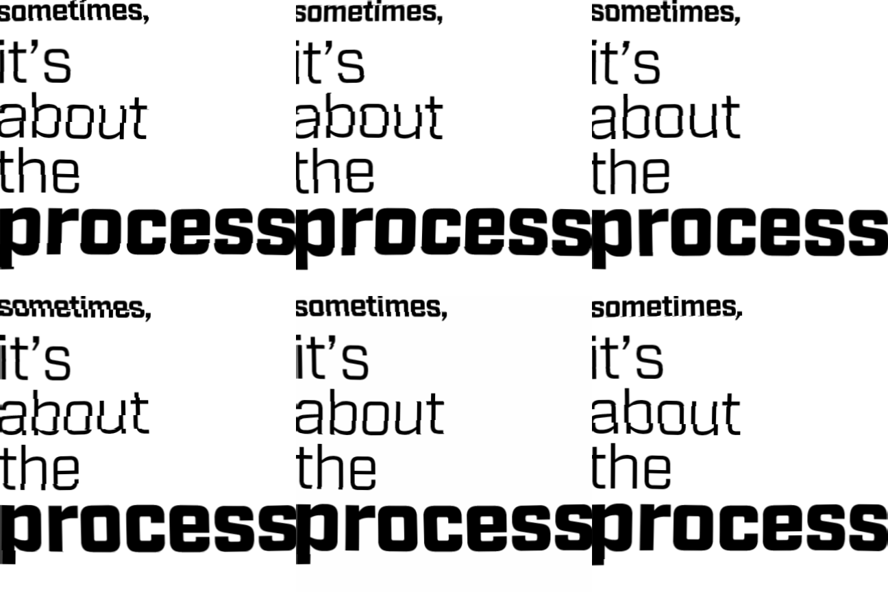
I’ve found the overall process of any work is one of the most rewarding (and beneficial) aspects of being a designer. Here’s an example:
This semester I’m taking Type III with a few other graduate students. We began the course with a grid workshop where we typeset 18 different pages (six grids, three variations each) and printed out three copies of each (54 pages.) In class during the workshop, we basically took the walls of text that we printed out and then slowly worked them into somewhat presentable pages.
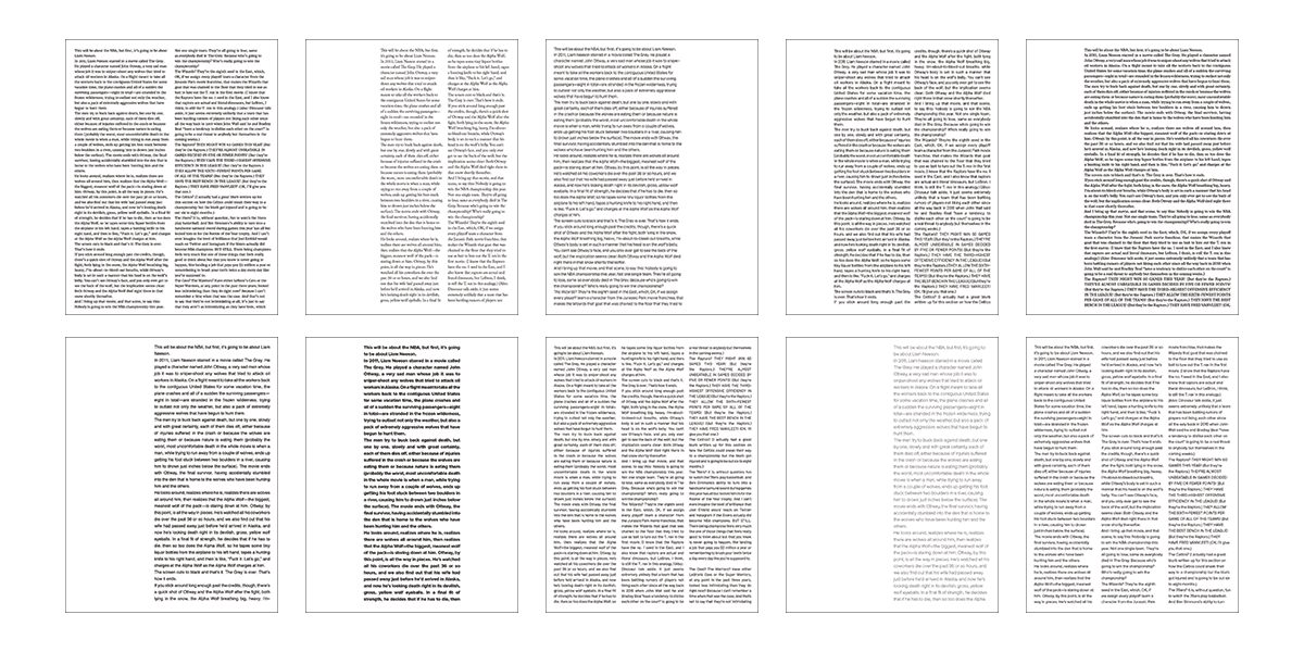
We started out simple, adding first-line indentations and removing lines of text to indicate paragraph breaks. Then, we started adding margins, columns and indenting full paragraphs/quotations. Finally, we combined these ideas and implemented more white space to emphasize certain sentences and paragraphs. Working with grids and text like this is very interesting and feels much different than working in InDesign. When starting with full pages of text, removing words to create white space feels much more purposeful; you really begin to see where these design elements are necessary. The workshop results are rough; but as you work your way through iteration after iteration, you begin to feel how the text should flow and be organized.
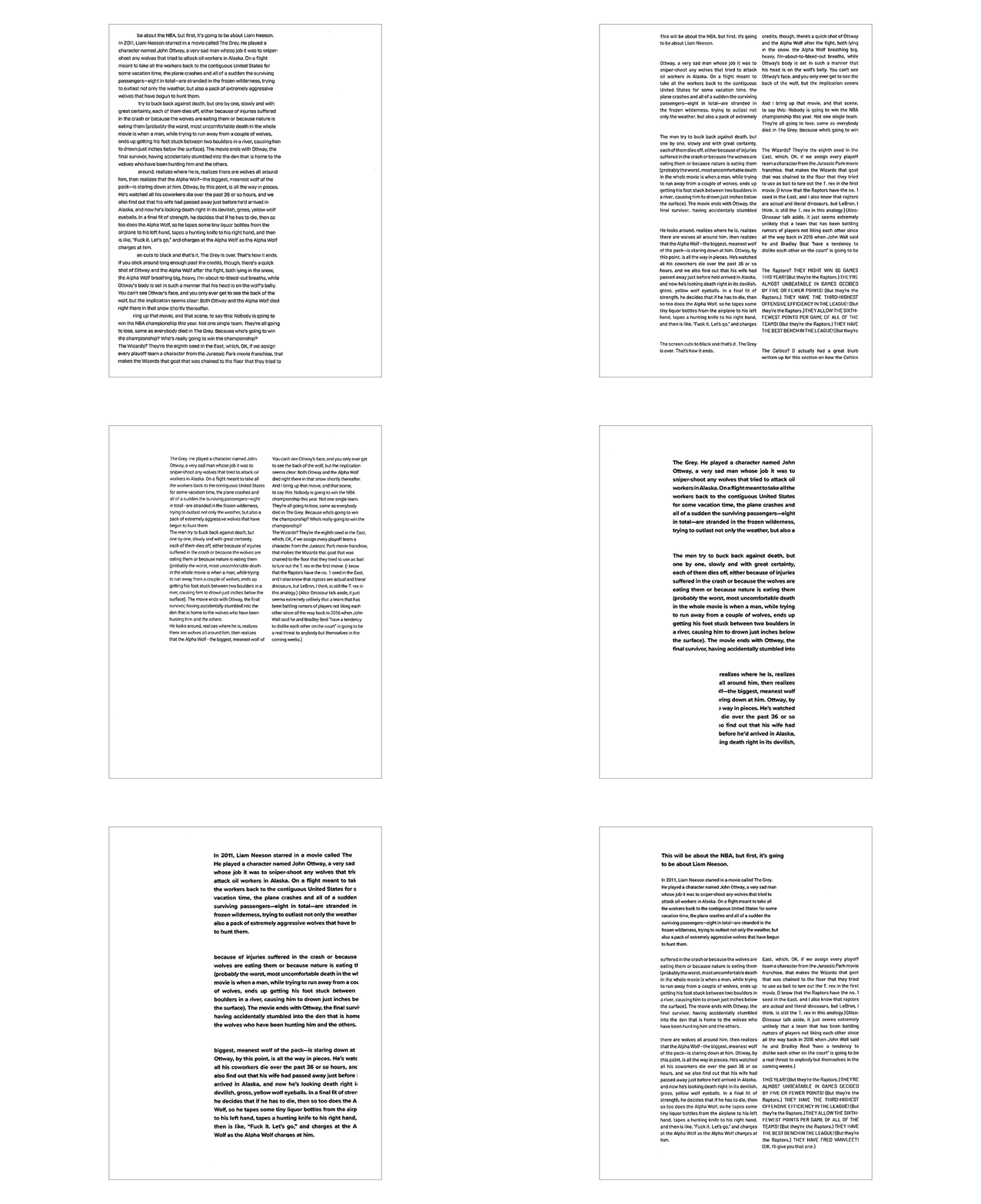
During the second part of the workshop we began to add levels of hierarchy to our previous results. We started out adding one addition level using design elements such as scale, weight, and contrast to create the hierarchy. We were asked to explore both subtle and conspicuous ways of creating hierarchy on the pages. After working with one level, we then moved to adding two levels of hierarchy to a page and went through the same process. We finished by selecting some of our favorites and then adding a third level to those, totaling in four levels of hierarchy.
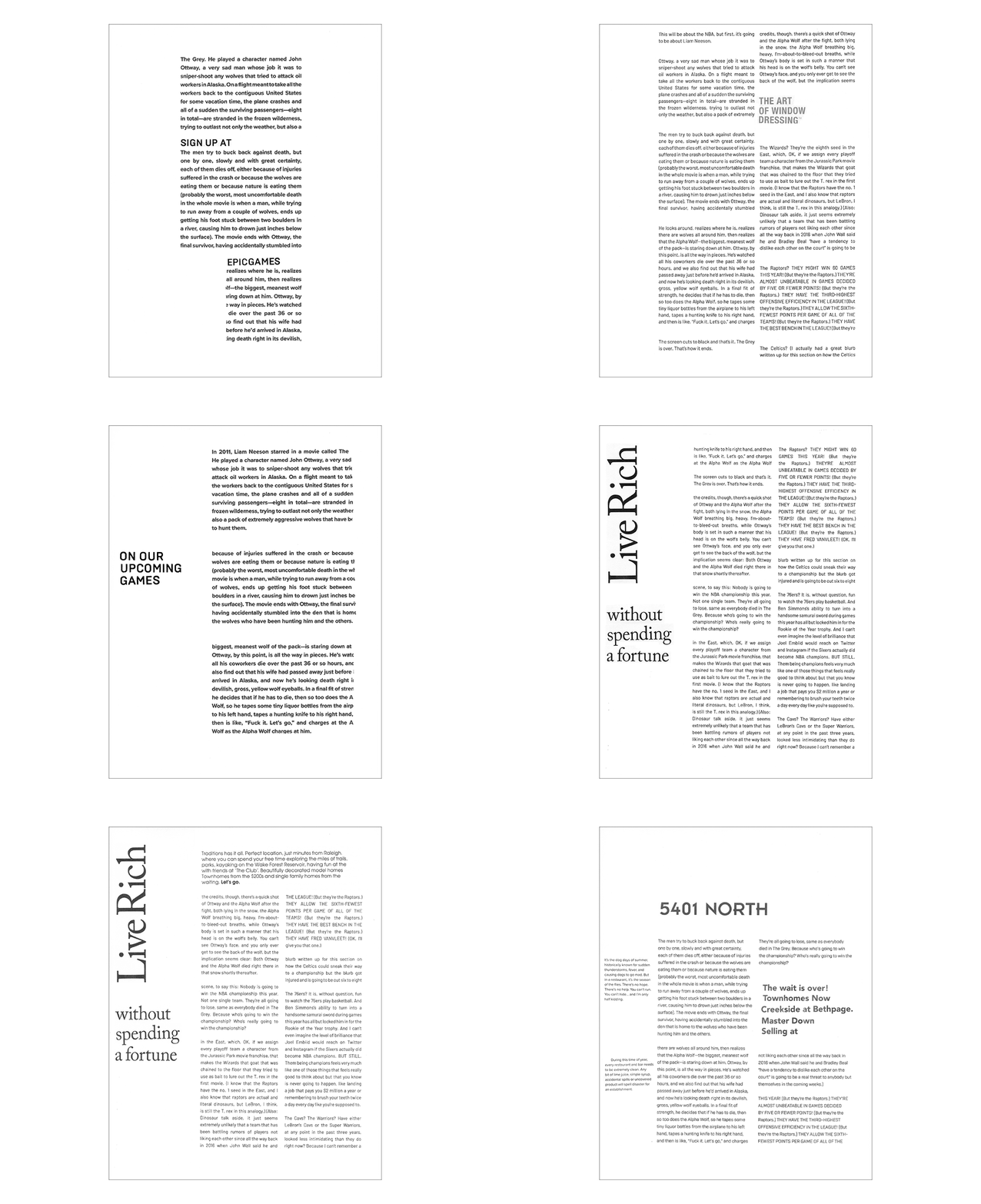
Like I said earlier, working physically makes the actions feel more purposeful. Adding space between paragraphs isn’t because you hit enter twice (or set the “space after” to the appropriate point setting,) it’s because you can feel there should be space there. With the animations, I can begin to see a trail from the walls of text to the semi-visually pleasing pages. Each action and result affected how I worked with the next page.
