Monday night data journalist Mona Chalabi spoke as part of Hunt Library’s Coffee and Data Viz series. She is data editor at Guardian US and previously worked for Nate Silver’s FiveThirtyEight. (She was also on the State of Things Wednesday.)
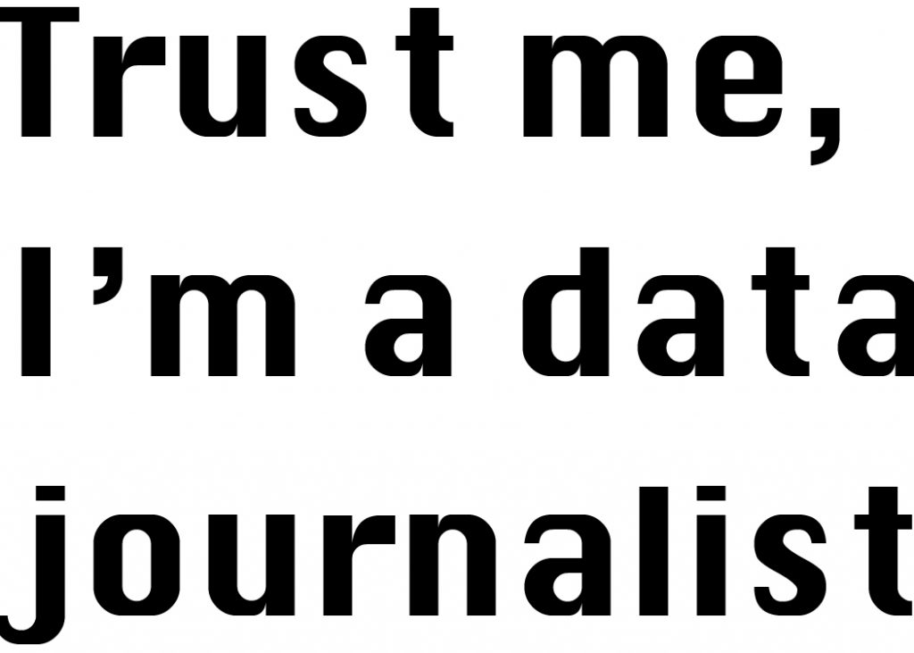
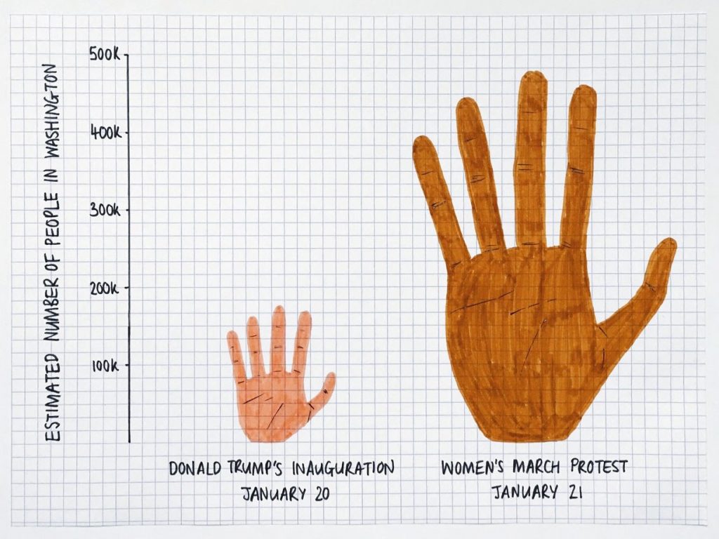
Chalabi discussed the rising number of American’s (on both sides of the aisle) that do not believe government statistics. Donald Trump played into that fear during his campaign, even going as far as calling unemployment numbers “totally fiction” and a “hoax.” Chalabi creates drawn data visualizations that attempt to make data feel more accessible and real to viewers.
The talk in general was really interesting when you think about our most recent studio project, “Lies, Damned Lies, and Statistics.” We were exploring the power designers have to mislead a viewer through data visualization, all while American’s are increasing their distrust of what they read in the media.
A friend of mine wrote an article a few years ago about American’s growing distrust in science. We recently had a conversation about how that distrust has only increased since she did her research. I think that distrust is part of what Chalabi, and in a way our project, was pointing to, and for me personally, is a really frightening idea. It makes me wonder how designers can use their own power over perception to make visualizations and media appear more trustworthy or transparent? Chalabi turns to accessible hand made visualizations, but how can we do that in the digital?