
Since thesis reading has taken over my life, I thought I’d share something interesting that I read. (For reference, I’m reading about data visualizations and data journalism.)
“visualisations that are highly engaging can appear disassociated from data sources, appear to advocate particular information by giving it prominence, or good visualisations might be interpreted as effort diverted away from the science. However, irrespective of content or function, compelling graphics can also create an impression of truth (a so-called ‘Cartohypnosis’) and a lower value or reputation can be attributed to poor designs”
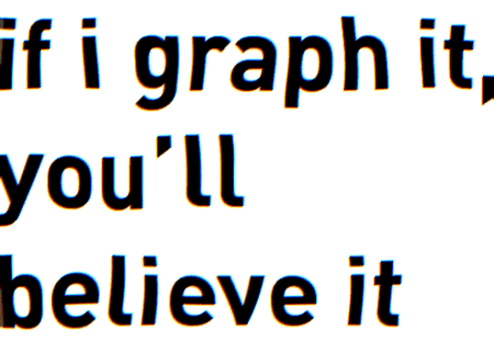
I love the term cartohypnosis. The idea that graphics lend credibility, whether it’s deserved or not, is a pretty powerful idea. (The whole idea lends a lot of credibility to our Lies, Damned Lies, and Statistics project last year!)
But then science-y people complicate the whole thing by thinking snazzy looking graphics are unreliable graphics. Guess you can’t please everyone.