
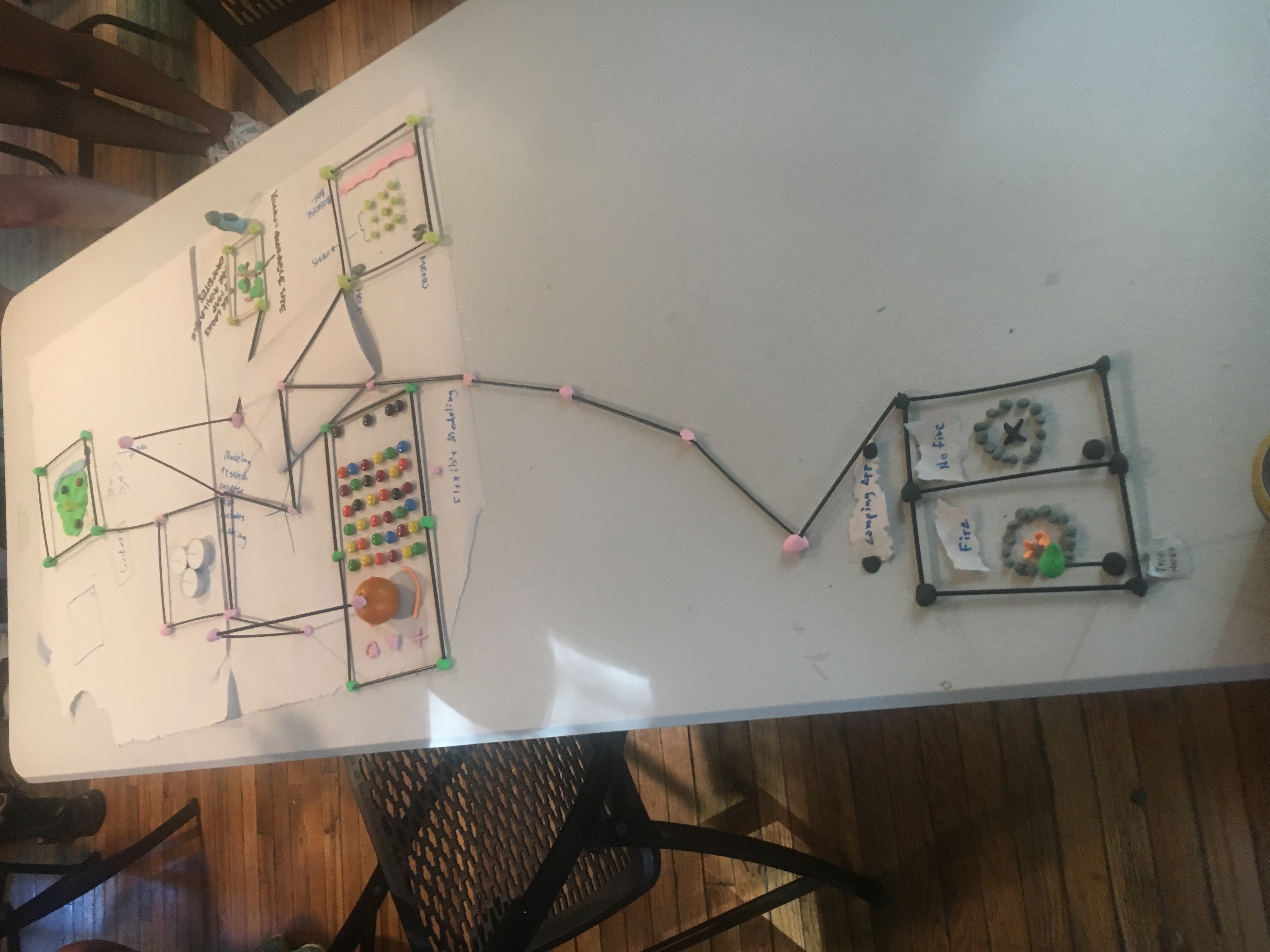
During our 2017 MGD retreat, we were prompted to design a “model for research that included making.” We were given sculpting tools like clay, straws, and stir sticks to show our model.
Under a time constraint and wanting to avoid the expected, the group I was in decided to utilize the “Flexible Modeling” design method to create a mobile app for campers (since we were kind of camping at the time).
We chose flexible modeling because it is participatory in that it allows end users to adjust elements of a design in a way that makes sense to them. It helps researchers understand what elements of an interface design are most important to the end user.
Rather than examining written researching, we jumped right into making. What is the first thing you think of when contemplating app design and camping? (I mean besides, can I get a cell signal?) And what would five designers create in 10 minutes?
We made from our individual perspectives and then later, explained our decisions to the group. Then we started to make connections with work of each other.
Interestingly, none of our interfaces directly overlapped with another. We made pages for (see photos):
- Planning = Finding an available camping spot
- Planning = Purchasing items specified to your trip
- Location = Finding your friends on the campgrounds
- Planning = Finding campgrounds that allow or restrict open flames
- Planning = Finding treehouses
- Interface = A general layout of a home screen
As I mentioned, one of our limitations was to physically show our model with sculpting tool. Which I found stimulating. With computers, we can design from a single pixel. But with clay, I can’t get that small or detailed (I suppose someone, somewhere will argue with that). What are the important UX shapes that I can make with clay? Rather than a flat app application flowchart, what would it look like for the app to move up, into 3D space? At least for me, this helps me view UX design differently.